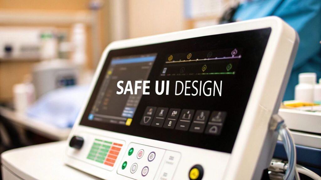
Picture this: a clinician in a high-stakes emergency, where a life hangs in the balance and a split-second decision is everything. The information they need is on a screen, and how clearly it's presented can mean the difference between success and failure. This is where medical device user interface design stops being a technical detail and becomes a life-saving necessity. It's the critical bridge between powerful technology and the person using it.
Why User Interface Design Is Critical in Healthcare

In healthcare, a user interface (UI) is so much more than what you see on the screen. It's the very core of patient safety and clinical effectiveness. When done right, a great UI empowers medical professionals, giving them the confidence to make quick, informed decisions. But when an interface is confusing or poorly designed, it introduces risk and can lead to errors with devastating consequences.
Think of the UI as an expert translator. Its job is to take a flood of complex machine data—vital signs, imaging results, infusion rates—and present it in a way a human can understand in an instant. When that translation is crystal clear, the device feels like a natural extension of the clinician's own expertise. But when it's jumbled or confusing, it becomes another obstacle, adding to their mental burden and creating opportunities for mistakes.
You can see the real-world impact of UI design every day. In high-pressure environments like an operating room or an ICU, every second matters. A clinician should never have to waste precious time trying to figure out a cryptic icon or navigate a maze of menus just to perform a critical task.
The Connection Between Usability and Patient Safety
The link between a device's usability and a patient's outcome isn't just a theory; it's a well-documented fact. Poor usability is a huge concern for manufacturers and regulatory bodies because it's a direct line to adverse events. In fact, studies show that errors made by users of medical devices contribute to 15-20% of adverse events in healthcare settings globally.
This is why agencies like the U.S. FDA now demand rigorous human factors engineering throughout the design process. The data tells a compelling story: between 2015 and 2020, recalls due to software interface problems made up over 30% of all medical device recalls. You can learn more about the evolving landscape of UI/UX in MedTech and the role of AI.
A medical device UI isn't successful because it looks good. It's successful because it stops a tired, stressed nurse from giving the wrong drug dosage at 3 AM. Its success is measured in errors prevented and outcomes improved.
Moving Beyond the Basics
Really grasping the weight of this responsibility is the first step toward creating truly excellent medical device interfaces. This guide will go beyond the basics to give you a complete look at the principles, workflows, and best practices that define this critical field. We'll dig into how to:
- Build human factors engineering into your process from day one.
- Navigate tricky regulatory standards like IEC 62366.
- Design for a wide range of users and the unpredictable environments they work in.
By focusing on these key areas, you'll get a practical playbook for creating interfaces that aren't just compliant, but are genuinely safe, effective, and built around the user.
Understanding Human Factors Engineering in MedTech

While we often talk about a great interface, the real science driving it is Human Factors Engineering (HFE). This isn't just about abstract theories; it's a hands-on discipline focused on how people actually interact with technology in the real world. At its core, HFE is the methodical process of designing systems that conform to human capabilities and limitations, rather than forcing people to adapt to a machine.
Think of a truly effective medical device user interface as the perfect surgical assistant. It anticipates what you need, presents information just when you need it, and reduces your mental burden during high-stakes moments. HFE provides the blueprint for creating that kind of seamless experience. It’s about so much more than making things look good—it’s about safety, efficiency, and fundamentally reducing the potential for human error.
Core Principles of Human Factors
At its heart, HFE is guided by a few foundational principles that directly shape the user experience. When you design with these in mind from the very beginning, you create an interface that feels less like a tool and more like a trusted partner, especially when the pressure is on.
- Minimizing Cognitive Load: Every piece of data, every button, and every alarm requires a bit of mental processing power. The goal of HFE is to strip away the noise and reduce this "cognitive load." By making tasks straightforward and showing only what's essential, you free up a clinician's mental energy to focus on what matters most: the patient.
- Intuitive Information Hierarchy: Critical information should jump off the screen and be understood at a glance. HFE is all about organizing information logically. The most important alerts and vitals need to command attention, while secondary data remains easily accessible without cluttering the main view.
- Contextual Design: An interface designed for a sterile operating room will have vastly different requirements than one used by a patient in their own home. HFE forces us to consider the physical environment, the user's emotional state, and their technical skill level.
A core tenet of Human Factors Engineering is that technology should serve the human, not the other way around. In medicine, this means designing an interface that is so intuitive it becomes almost invisible, allowing the clinician to remain completely focused on patient care.
Designing for Specific Use Cases
The way we apply these HFE principles changes dramatically depending on the device's purpose and who will be using it. When it comes to effective medical device user interface design, context is everything. A one-size-fits-all approach is a recipe for failure.
Just think about the different demands placed on these devices:
- Operating Room Monitors: These need high-contrast displays with large, crystal-clear fonts that a surgeon can read from across the room. Alarms must be unmistakable, cutting through the noise and chaos of a busy OR. There is absolutely no room for misinterpretation.
- Home-Use Wearables: For a patient using a glucose monitor at home, the interface has to be simple and reassuring. It must accommodate people who aren't tech-savvy and may have vision or dexterity challenges. The design's job is to empower the patient, not intimidate them.
- Paramedic Tablets: In a frantic emergency scene, a paramedic needs an interface that’s rugged, works with gloved hands, and is readable in bright sunlight or total darkness. The entire workflow has to be lightning-fast to allow for rapid data entry and retrieval under extreme stress.
By truly understanding the user and their environment through HFE, we can build interfaces that aren't just usable but are perfectly optimized for their specific job. This foundation is non-negotiable for creating a medical device user interface that works in harmony with human capabilities, leading to safer and more effective healthcare.
Navigating Medical Device UI Regulations
When you're building a medical device, compliance isn't just about ticking boxes on a form—it's the very foundation of patient safety. For medical device UI design, these regulations act as a critical roadmap, steering designers toward interfaces that aren't just intuitive, but demonstrably safe. They force us to move beyond subjective "good design" and into the realm of objective, testable safety requirements.
Think of it like a building code for your software. An architect can’t just design a beautiful building; they have to follow strict codes to ensure it won’t collapse. In the same way, UI designers must follow specific standards to prevent use-related errors that could lead to patient harm. Ignoring these rules is a direct threat to a patient's health and your product's chances of ever making it to market.
At their core, these regulations mandate the use of Human Factors Engineering (HFE). They require you to systematically find, analyze, and fix risks tied to how people interact with your device. This entire process has to be documented from start to finish, creating a bulletproof trail of evidence that safety was your top priority.
Key Standards and Regulatory Bodies
While there are many regional rules, a handful of standards are the bedrock of medical UI regulation worldwide. Getting to know them is non-negotiable for any team in this space. These standards aren't just red tape; they are the collected wisdom of the industry on how to build safe systems.
Here's a quick look at the most important ones:
| Standard/Guidance | Governing Body | Core Focus Area | Key Requirement Example |
|---|---|---|---|
| IEC 62366-1 | International Organization for Standardization (ISO) / IEC | Usability Engineering Process | Requires manufacturers to follow a detailed process to analyze, specify, develop, and evaluate the usability of a medical device as it relates to safety. |
| FDA Guidance on Human Factors | U.S. Food and Drug Administration (FDA) | Validation & Safety Demonstration | Mandates summative (validation) testing with representative users to prove the device can be used safely and effectively in its intended environment. |
These standards aren't meant to be roadblocks. They are your guide to integrating proven safety principles directly into your design lifecycle, ensuring you catch potential problems long before they can affect a patient.
The big idea behind all this regulation is simple: The burden of safety is on the designer, not the user. You have to prove that your interface makes it incredibly difficult for someone to use it incorrectly.
This journey from a simple idea to a fully tested interface is an iterative one. Prototyping evolves from rough sketches to highly detailed, interactive models that can be used for the kind of rigorous testing regulators demand.
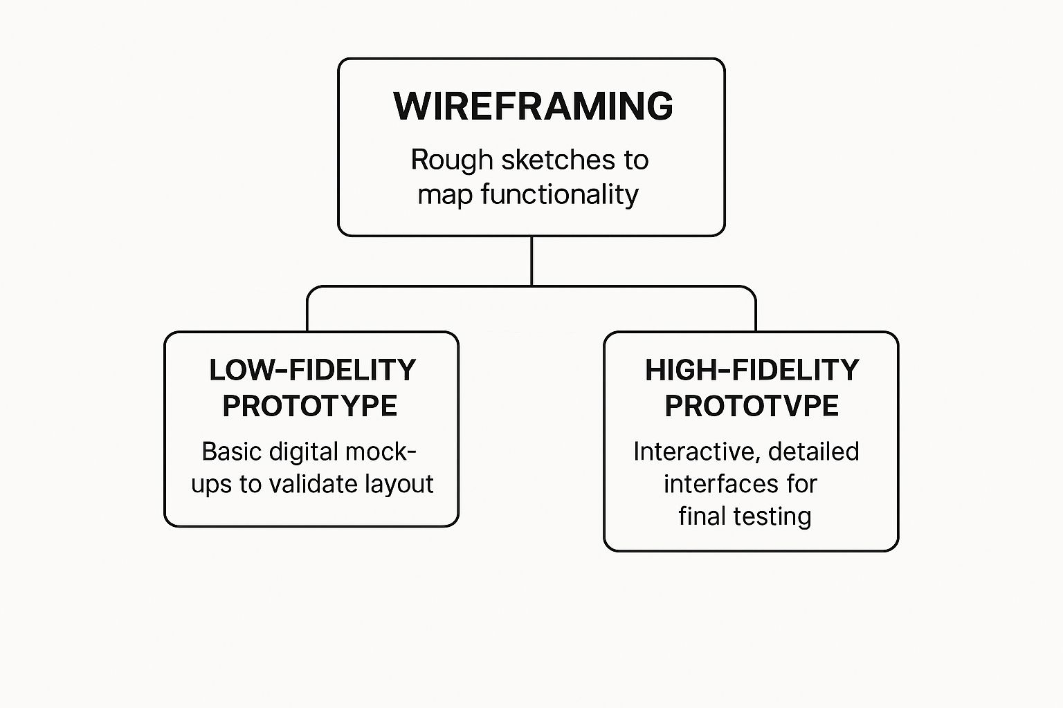
Each stage shown here, from basic wireframes to high-fidelity mockups, is a crucial step in fulfilling the evaluation cycles required by standards like IEC 62366-1.
The Usability Engineering File Explained
A critical piece of the compliance puzzle is the Usability Engineering File. This isn't just one document; it’s a comprehensive collection of records that tells the entire usability story of your device, from concept to final product. It’s the official evidence you submit to regulatory bodies.
Think of it like the detailed case file a lawyer prepares for a major trial. It has to contain every piece of evidence to show you followed a meticulous, risk-based process.
Here’s what you’ll typically find inside:
- Use Specification: Who are the intended users? Where will they use the device? What medical conditions does it address? This sets the scene for everything that follows.
- Hazard and Risk Analysis: A deep dive into all potential use-related dangers. What if a nurse misinterprets a critical alarm? What if a tired resident enters the wrong dosage? Each potential hazard is identified and analyzed.
- Formative Evaluations: These are your early-stage "practice runs." You conduct usability tests throughout the design process to find and fix flaws long before the design is set in stone.
- Summative (Validation) Testing: This is the final exam. You test the finished UI with real users performing critical tasks to prove, once and for all, that the device is safe for its intended use.
Trying to bolt on compliance at the end of a project is a recipe for disaster. The most successful teams treat these regulations not as a constraint, but as a framework for excellence. By weaving these activities into your project from day one, you build safety and usability directly into your device's DNA, creating a much stronger and more reliable product.
Designing for Different Users and Environments
Medical devices almost never live in a quiet, pristine lab. They're put to the test in the real world—in chaotic emergency rooms, dimly lit patient bedrooms, and sterile operating theaters. That’s why effective medical device user interface design has to be built for these unpredictable, often stressful conditions. A one-size-fits-all UI simply won't cut it; it has to be robust enough to work flawlessly, no matter the situation.
Think about the wide range of people who will interact with the device. An interface designed for a highly trained surgeon during a delicate procedure has completely different needs than one for an elderly patient managing a chronic condition at home. The surgeon needs dense data and precise controls, while the patient requires absolute simplicity, clear guidance, and a sense of reassurance.
An interface is only as good as its performance in the most challenging scenario it will face. A UI that works perfectly in a quiet office but fails in a noisy, high-pressure clinical setting is a failed design.
The environment itself throws a whole host of curveballs at a UI. To keep a device safe and usable, you have to anticipate and overcome these physical and sensory obstacles.
- Lighting Conditions: A screen has to be just as readable under the harsh glare of an operating lamp as it is in the near-darkness of a patient's room at 3 a.m. High-contrast modes and adjustable brightness aren't just nice features; they're critical safety requirements.
- Auditory Noise: Alarms and audio feedback must be sharp and distinct enough to slice through the constant symphony of beeps and background noise on a busy hospital floor.
- Physical Interaction: Clinicians are almost always wearing gloves, which makes interacting with small touch targets a nightmare. Buttons and interactive elements must be large enough to accommodate this, preventing frustrating and potentially dangerous input mistakes.
Adapting to Diverse Clinical Workflows
Beyond the individual user, a good UI has to fit seamlessly into wildly different clinical workflows. A paramedic using a device in the back of a moving ambulance faces different demands than a nurse using the same device at a stationary hospital ward. This is particularly true for specialized medical carts and workstations, which are designed to be mobile and adapt to various clinical settings.
This challenge has only grown as healthcare moves beyond the hospital's four walls. The explosion of wearable medical devices has completely reshaped user interface design. Think of continuous glucose monitors or cardiac monitors—their interfaces must work for users in every imaginable environment. In fact, usability studies show that wearables with intuitive UIs—featuring high-contrast displays and simplified interactions—can boost patient adherence by up to 30%.
Designing for a Spectrum of Abilities
Accessibility is another non-negotiable pillar of medical UI design. Your user base isn't a monolith. It's a spectrum of people with varying levels of tech-savviness, cognitive function, and physical ability.
User Archetypes and Their Needs
| User Type | Key UI Requirements | Example Scenario |
|---|---|---|
| Expert Clinician | Data-dense displays, shortcut controls, detailed configuration options. | A surgeon configuring a robotic surgical system before a procedure. |
| Home Caregiver | Simple navigation, clear step-by-step instructions, prominent alerts. | A family member helping an elderly parent use an at-home infusion pump. |
| Elderly Patient | Large fonts, high-contrast colors, simple iconography, minimal steps per task. | An 80-year-old patient checking their blood pressure on a home monitoring device. |
Ultimately, designing for different users and environments comes down to empathy. It’s about putting yourself in the shoes of every single person who might touch that device—the hurried nurse, the anxious patient, the intensely focused surgeon—and building an experience that supports them perfectly in their moment of need. This context-aware approach is what separates a merely compliant UI from a truly safe and effective one.
Putting Theory Into Practice: Actionable Best Practices for Modern Medical UI
This is where the rubber meets the road. All the theory and regulations in the world don't mean much until you translate them into a functional, safe, and intuitive interface. Moving from a great idea to a great product means rolling up your sleeves and focusing on the small details that make a massive difference in high-stakes clinical environments.
These aren't just suggestions; they’re proven methods for building interfaces that clinicians trust and patients can navigate. They’re what separates a complex machine from an intuitive tool that genuinely improves healthcare.
Prioritize Clarity Above All Else
In a clinical setting, ambiguity can be outright dangerous. Every single element on the screen, whether it's a button or a patient data point, has to be understood in a split second. There's simply no time for a user to pause and interpret what something means, especially when they're under stress.
This relentless focus on clarity needs to permeate every corner of your design:
- Unambiguous Iconography: Steer clear of abstract or overly clever icons. A symbol for "save" should look like a classic floppy disk or a cloud, not some artistic interpretation that requires a manual to decipher. Always test your icons with actual users to make sure their meaning is universal.
- Plain Language: Talk like a person, not a technical manual. Instead of "Execute Infusion Protocol," just say "Start Infusion." This simple change dramatically reduces cognitive load and makes the device approachable for everyone, regardless of their technical background or English proficiency.
Strategically Use Color and Contrast
Color is an incredibly powerful communication tool, but it’s one you have to use with purpose and restraint. It can guide the user's eye, highlight critical information, and signal status changes. But relying on it as your only tool is a surefire way to exclude people.
A 2021 study found that about 1 in 12 men and 1 in 200 women have some form of color vision deficiency. That's a significant slice of your user base. Because of this, color can never be the sole method for conveying critical information.
The best medical UIs use color as a backup singer, not the lead vocalist. An alarm, for example, should grab attention with color (like red), an icon (a bell), and text ("Critical Alert").
This multi-pronged approach ensures that every user gets the same vital message. A fantastic habit to get into is designing and testing in grayscale first. If your interface is perfectly clear without color, you know you’ve built a solid foundation.
Visualize Data for Instant Comprehension
Clinicians are constantly drowning in data. A raw table of numbers is overwhelming and almost impossible to process quickly. A great UI does the heavy lifting, translating that flood of complex data into visuals that deliver at-a-glance insights.
Here are a couple of ways to do that effectively:
- Trend Graphs: Don't just list a patient's blood pressure readings from the last hour. Plot them on a time-based graph. A nurse can instantly see a concerning trend—like a sudden drop or a steady climb—that would be nearly invisible in a wall of numbers.
- Color-Coded Ranges: Use color to draw attention to values that fall outside the normal range. A blood oxygen level of 92% might be shown in yellow to gently flag a potential issue, while a reading of 85% would be in bright red to signal a critical state.
This patient monitor is a perfect example of how color and clear labels can distinguish between different data streams.
The design uses distinct, high-contrast colors and bold labels for each vital sign, making it easy for a clinician to absorb critical patient information in a single glance.
Map Out Intuitive Navigation Paths
A user should never feel lost inside your interface. The navigation needs to feel as logical and predictable as the clearly marked hallways in a well-designed hospital—it should get people where they need to go without a moment of confusion. To explore this further, you can review various methods to improve user experience design that apply just as well to medical devices.
Here’s how you can build navigation that just makes sense:
- Follow Established Patterns: Don't try to reinvent the wheel. People are already familiar with common navigation patterns like tabs across the top or a menu on the left side. Leaning on these conventions makes your device feel familiar from the very first use.
- Limit Menu Depth: Avoid burying important functions under layer after layer of menus. The "three-click rule" is a great guideline to follow: a user should be able to get to any critical function in three clicks or less.
- Provide a Clear "Back" or "Home" Path: Always give users a safety net. A consistent and obvious way to go back to the previous screen or return to the main dashboard gives them the confidence to explore the interface without worrying about getting stuck.
Common Questions About Medical Device UI Design
Even after getting a handle on the principles and regulations, a few common questions always seem to pop up during the design process. Let's tackle them, because the answers reveal the real, day-to-day challenges and opportunities we face in this field.
Thinking through these questions is a great way to understand the balancing act that defines medical device UI design—it's a constant negotiation between human needs, what's technologically possible, and what the regulators demand for safety.
What Is the Biggest Challenge in Medical Device UI Design?
If you have to boil it down to one thing, the single biggest challenge is designing for wildly different users while staying within strict regulatory lines. Think about it. An interface might need to be simple enough for an anxious patient to use at home, but also powerful and efficient enough for a specialist in a high-stakes operating room.
You're designing for a huge range of technical skills, cognitive loads, and physical settings. One user could be a seasoned expert who craves efficiency, while another might be using the device for the first time, feeling stressed and uncertain.
The core difficulty lies in achieving a perfect harmony between intuitive usability for the novice, deep functionality for the specialist, and the provable, documented safety demanded by standards like IEC 62366. Nailing this trifecta is the ultimate goal and the toughest part of the job.
How Is AI Changing Medical Device Interfaces?
Artificial intelligence is fundamentally changing the role of a user interface. It’s shifting them from being passive displays of information to active, intelligent partners in providing care. Instead of just showing data, AI-powered UIs can start to interpret it, offering predictive insights and clinical decision support that a human might otherwise miss.
For example, AI can automate repetitive but critical tasks, like certain types of data entry, which cuts down on human error and gives clinicians more time to focus on their patients. It can also analyze complex data streams in real time—like from an ICU monitor—to flag potential problems before they become emergencies. For patients, AI can help translate dense medical information into simple, actionable insights, empowering them to take a more active role in their own health.
Why Is Patient-Centered Design So Important Now?
With the explosion of at-home health monitors and medical wearables, patient-centered design isn't just a nice-to-have; it's absolutely critical for safety and success. The design focus has to shift from the controlled, sterile environment of a clinic to the messy, unpredictable reality of a person's life. This means thinking deeply about their abilities, emotional state, and home environment.
In practice, this translates to tangible design choices that make a world of difference:
- Using plain, simple language instead of confusing clinical jargon.
- Providing clear, reassuring feedback to confirm that an action was successful and reduce user anxiety.
- Ensuring physical accessibility through things like large buttons and high-contrast text for those with visual impairments.
- Designing for non-ideal conditions, like a dimly lit bedroom or a noisy, distracting public space.
When you bring patients into the design process, the final product is one they are far more likely to use correctly and consistently. This involvement directly improves how well they stick to their treatment, which ultimately leads to better health outcomes. By putting the patient first, we build technology that truly serves them.
At PYCAD, we specialize in integrating advanced AI to enhance medical imaging interfaces, improving diagnostic accuracy and operational efficiency. If you're looking to build the next generation of intelligent medical devices, explore our services.