You can't start measuring operational efficiency until you know what you're aiming for. It's about translating those big-picture business objectives, like cutting costs or seeing more patients, into concrete, measurable goals that your entire team can understand and work toward.
Establishing Your Operational Efficiency Goals

Trying to track metrics without a clear destination in mind is like driving without a map. Sure, you're moving, but are you getting any closer to where you want to be? The first and most important step is to set clear, tangible goals that define what success actually looks like for your practice.
This process forces you to move beyond vague aspirations like "be more efficient" and get real about what that means. For a medical imaging center, does "more efficient" mean shorter patient wait times? More scans per day? A lower cost per procedure? You have to define it.
From Broad Objectives To Specific Targets
Let's walk through a common scenario. Imagine a diagnostic imaging center has a high-level objective to "reduce operational costs." That’s a good start, but it's not something you can directly measure or act on. We need to break it down into specific targets for the core processes.
Here's how that might look:
- For Patient Scheduling: A concrete goal could be to slash the no-show rate from 15% down to 8% within the next six months. This directly tackles wasted machine time and idle staff.
- For the Imaging Workflow: The team might aim to decrease the average MRI turnaround time—from the moment a patient checks in to when the images are acquired—by 20%.
- For Radiologist Reporting: A powerful objective would be to shorten the report finalization time for non-urgent cases from 24 hours to just 12 hours, which significantly improves satisfaction for referring physicians.
Each of these targets is specific, measurable, and directly supports the larger goal of cost reduction. They give you a clear baseline to measure your progress against.
Creating a Shared Vision
Setting these goals shouldn't just be a top-down decision. The people on the front lines—your technologists, schedulers, and radiologists—have a ground-level view of the real bottlenecks and opportunities. Bringing them into the goal-setting conversation creates a sense of shared ownership and ensures everyone is pulling in the same direction.
This foundational step is all about creating a shared understanding of what peak performance means in your unique environment. When your team knows the target, they can help you hit it.
This structured approach is becoming the standard. In fact, by 2025, 42% of organizations are expected to have enterprise-wide operational excellence strategies in place, up from 37% in 2023. This jump shows a growing consensus that a solid strategy, starting with clear goals, is crucial for any real improvement.
Once you have this framework of goals, it acts as a lens for all the data you collect. It provides the context you need to see if the changes you're making are actually moving the needle. If you're serious about boosting performance, this complete guide to improving fleet efficiency offers a great starting point for understanding where you stand and planning your path to operational excellence.
Choosing the Metrics That Actually Matter
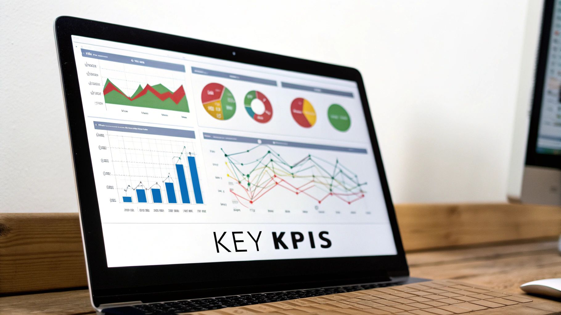
Once your goals are locked in, the real work begins: picking the right numbers to track. It's so easy to fall into the "measure everything" trap, where you're drowning in data but have no real idea what's going on. The secret to learning how to measure operational efficiency is to focus on a handful of key performance indicators (KPIs) that tell the whole story.
If you fixate on just one area, you'll inevitably create problems elsewhere. For instance, focusing solely on patient throughput might push your team to rush procedures. That sounds efficient, but it often leads to a spike in repeat scans and a dip in diagnostic quality. A balanced approach helps you see the whole picture and avoid those unintended consequences.
The best way I’ve found to do this is by sorting metrics into four buckets: input, output, quality, and financial. This simple framework forces you to look beyond just speed and consider the resources, costs, and quality that go into every scan.
Creating a Balanced Scorecard
A balanced view isn't about tracking dozens of metrics. It's about picking a few vital signs from each category. This gives you a holistic understanding of performance, showing how a change in one area—like a new scheduling protocol—ripples through the others.
Here’s how this might look for a typical imaging center:
-
Input Metrics: Think of these as the resources you're spending. It’s the "cost" of getting the work done in terms of time, labor, and equipment.
- Technologist Time Per Scan: How many minutes does a tech really spend on a single procedure, from prepping the patient to sending the final images?
- Machine Utilization Rate: What percentage of the day is your MRI or CT scanner actually scanning patients versus sitting idle?
-
Output Metrics: This is the classic productivity stuff—the volume of work you’re getting done.
- Number of Scans Per Day/Week: A straightforward count of studies completed on a specific machine or across the whole department.
- Patient Throughput: The total number of patients your center serves in a given shift, day, or week.
This approach immediately highlights imbalances. If your output is soaring but it's because of a huge spike in staff overtime (an input), you're not actually becoming more efficient.
Protecting Quality and Financial Health
Speed and volume are useless if the work is shoddy or your budget is bleeding. Quality and financial metrics are the essential guardrails that keep your efficiency efforts from going off the rails.
I’ve seen it happen time and again: a department chases output at all costs. True operational efficiency is about doing more with the same (or fewer) resources without sacrificing patient care or financial stability.
Let's round out the scorecard with the final two categories:
-
Quality Metrics: These KPIs are all about accuracy and effectiveness.
- Report Error Rate: What percentage of radiology reports need to be corrected after being signed off?
- Repeat Scan Rate: How often do you have to bring a patient back for a second scan because of motion, technical errors, or other quality problems?
-
Financial Metrics: This is where you connect your operational performance directly to the bottom line.
- Cost Per Scan: What is the all-in cost—direct and indirect—to perform a single imaging study?
- Revenue Per Technologist: How much revenue does each full-time technologist generate? This links your labor input directly to financial output.
Understanding how to select and interpret KPIs is fundamental to improving any operation. For a different perspective, you can learn a lot by mastering call center performance metrics, as the principles of tracking service delivery have some valuable parallels.
Make Your Metrics S.M.A.R.T.
Okay, you've got a list of potential metrics. The final filter is to run each one through the S.M.A.R.T. framework. This is more than just a business school acronym; it's a practical check to ensure every KPI is concrete, trackable, and actually tied to the goals you set earlier.
Each of your metrics needs to be:
- Specific: Nail down exactly what you're measuring. "Scan time" is vague. "Technologist time per MRI brain scan" is specific.
- Measurable: You have to be able to quantify it. Can you actually pull this data from your RIS or PACS without a massive manual effort?
- Achievable: Is the target you set for this metric actually realistic for your team and your resources?
- Relevant: Does improving this number directly contribute to one of your big-picture operational goals?
- Time-bound: Give yourself a deadline. For example, "Reduce the repeat scan rate by 5% over the next quarter."
By taking the time to select a balanced set of S.M.A.R.T. metrics, you're not just collecting data. You're building a powerful dashboard that shows you exactly where you are and, more importantly, points the way forward.
Gathering and Analyzing Your Performance Data

So, you've defined your S.M.A.R.T. metrics. That’s the strategic part. Now comes the tactical part: actually getting the data. This is where the rubber meets the road, and honestly, it’s where a lot of efficiency initiatives fall flat.
The good news? You’re probably already sitting on a goldmine of data. For any imaging center, this information is hiding in plain sight within your Radiology Information System (RIS), Picture Archiving and Communication System (PACS), and Electronic Health Record (EHR). The trick isn't buying a fancy new tool; it's about learning how to tap into the systems you already own to understand how to measure operational efficiency.
Manual Tracking vs. Automated Capture
Right away, you'll face a big question: do we get our team to track this stuff manually in a spreadsheet, or do we figure out how to pull it automatically? Both have their pros and cons, and the best answer depends on your resources and what you’re trying to measure.
-
Manual Tracking: This is the low-cost, get-it-done-now approach. It's great for short-term projects or for capturing data that software can't easily see, like the reasons for scan delays. The downside is that it's a drain on your team's time and, let's be real, it's prone to human error.
-
Automated Capture: Pulling data directly from your RIS or PACS is the gold standard for accuracy and consistency. It gives you an objective, continuous stream of information without burdening your staff. The initial setup can be a hurdle, though, and you might need some help from IT to get the reports configured correctly.
In my experience, a hybrid model is usually the most practical solution. Focus on automating the core, high-volume metrics like patient throughput and report turnaround time. Then, use manual tracking for targeted, deep-dive projects where you need more qualitative insight.
The Critical Importance of Data Quality
Let's be blunt: bad data is worse than no data at all. If your team can't trust the numbers, they'll never buy into the changes you propose based on them. Before you dive into any analysis, you have to get your data hygiene in order.
This means getting everyone on the same page. If you're tracking "scan duration," does the clock start when the patient walks into the room or when the imaging actually begins? Define these terms with absolute clarity and make sure the whole team understands them.
The first rule of data analysis is simple: garbage in, garbage out. A little extra time spent upfront ensuring your data is clean and consistent will prevent you from making massive strategic blunders later on.
Make it a habit to scan your data for weird outliers or inconsistencies. A sudden, massive spike in average procedure time is more likely a data entry mistake than a sudden collapse in performance. Data cleansing isn't a one-and-done task; it's a discipline that protects the integrity of your entire efficiency program.
The way we even think about this is changing. By 2025, performance measurement will be deeply embedded in complex digital systems and automated workflows—a world away from simply trying to cut costs. To see what's coming, it's worth exploring the top five operational efficiency trends shaping the industry.
Turning Numbers Into Actionable Insights
Once you have clean, reliable data, it's time to make it talk. You don't need a Ph.D. in statistics to find powerful insights. Start simple.
Use basic line charts to track your key metrics over time. This is the easiest way to visualize trends, spot seasonal dips or surges, and see if that new workflow you implemented is actually making a difference.
From there, look for connections. Does a drop in your scanner utilization rate happen to coincide with a rise in patient no-shows? Connecting those dots is how you move from just collecting numbers to uncovering the root causes of inefficiency. This is the moment your data stops being a spreadsheet and starts telling a story about your operations—a story that shows you exactly where your biggest opportunities are hiding.
Turning Raw Numbers into Actionable Insights
Once you've got clean, reliable performance data, the real work begins. This is where you transform those raw numbers into meaningful efficiency ratios—the metrics that tell the true story of your operational health. Think of it less as complex math and more as simple storytelling. By calculating ratios, you can finally make fair comparisons, whether you're tracking your own progress or seeing how you stack up against the competition.
The basic idea is incredibly simple: divide what you produced (your output) by what it took to produce it (your input). This fundamental concept is the key to understanding how to measure operational efficiency.
This visual neatly summarizes the journey from collecting data to calculating your final ratio.
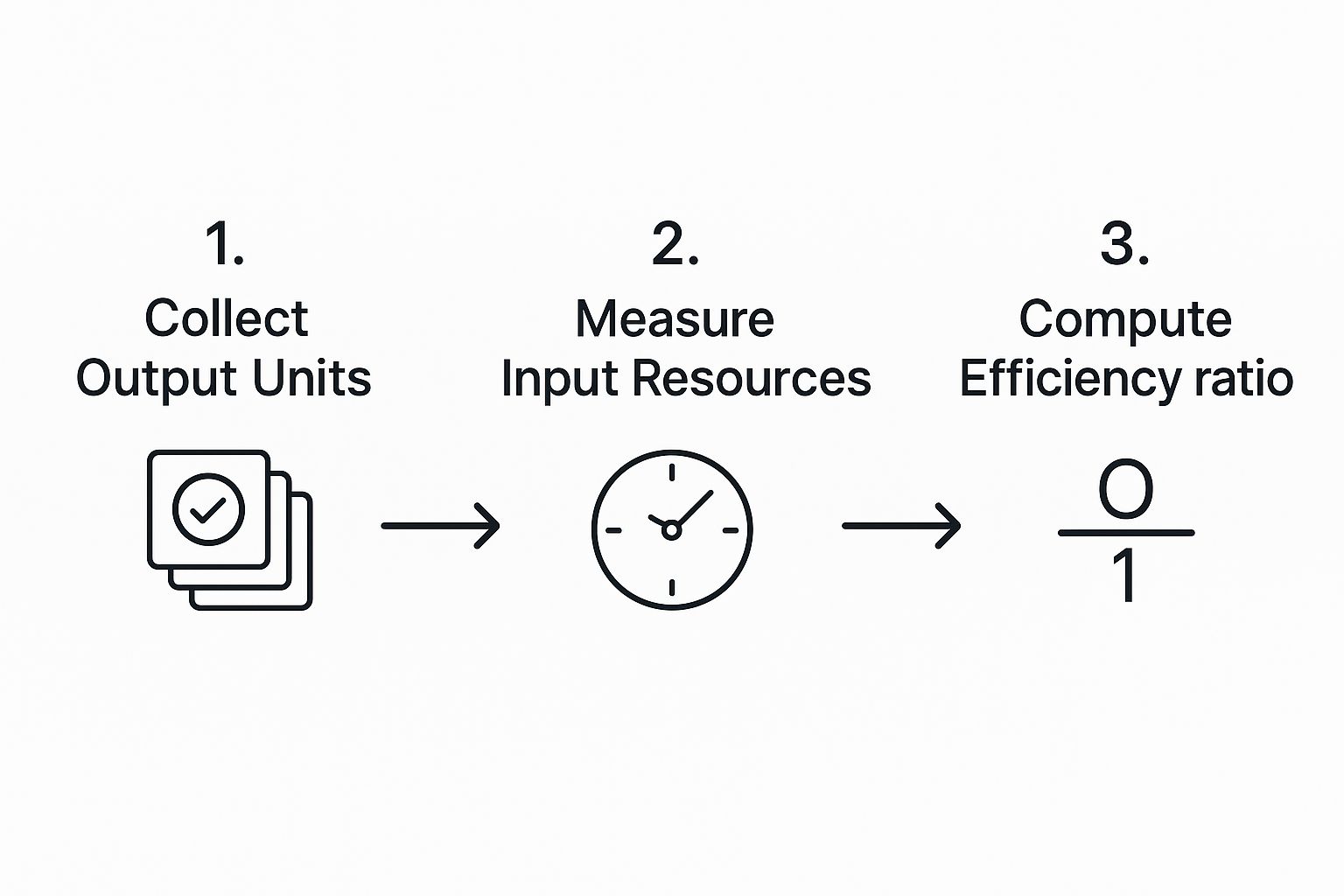
As you can see, the final number is only ever as good as the data you feed into it. Garbage in, garbage out.
To make this more tangible, here are a few core efficiency ratios you can start calculating in your own imaging center.
Operational Efficiency Calculation Examples
| Efficiency Ratio | Formula | Example Application |
|---|---|---|
| Asset Utilization Rate | (Total Hours Machine is in Use / Total Available Hours) x 100 | An MRI machine is available for a 10-hour shift but only actively scans for 7 hours. Its utilization rate is 70%. This highlights 3 hours of costly downtime. |
| Labor Productivity Ratio | Total Scans Completed / Total Technologist Hours Worked | Two technologists work a combined 16 hours and complete 24 CT scans. Their productivity is 1.5 scans per technologist hour. |
| Report Turnaround Time | Time of Report Signature – Time of Scan Completion | A radiologist signs off on a report at 3:00 PM for a scan that was completed at 11:00 AM the same day. The turnaround time is 4 hours. |
| Patient Throughput | Total Patients Scanned / Total Operational Hours | An imaging center scans 40 patients over an 8-hour day. The patient throughput is 5 patients per hour. |
These simple calculations move you beyond surface-level counts (like "we did 24 scans today") to powerful rates you can track, analyze, and ultimately improve.
The Power of Benchmarking: Adding Context to Your Numbers
Calculating your own ratios is a great start, but those numbers exist in a vacuum. A productivity rate of 1.5 scans per hour is just a number—is it good? Bad? Average? This is where benchmarking comes in.
Benchmarking is what turns your data into intelligence. It answers the crucial question: "How are we really doing?" Without that external perspective, you're flying blind.
You have two main ways to approach this:
-
Internal Benchmarking: This is all about comparing your performance against yourself. You might track your MRI utilization rate month-over-month to see if that new scheduling protocol is actually working. It’s the best way to see the direct impact of your own improvement efforts.
-
External Benchmarking: Here, you measure your ratios against industry averages or even direct competitors. This data can be tougher to get your hands on, but it provides priceless context. Professional associations and industry reports are your best friends here.
For example, labor productivity is a major focus of economic analysis worldwide. The 2025 OECD Compendium of Productivity Indicators shows just how much performance can vary between countries and sectors, proving how much operational choices matter. You can dig into the full report for more insights on global productivity trends on OECD.org.
By blending your internal calculations with external benchmarks, you can finally set realistic, ambitious goals. If your asset utilization is hovering around 65% but you learn the industry average is closer to 80%, you’ve just uncovered a clear, quantifiable opportunity. This data-driven approach takes the guesswork out of management and focuses your energy where it will make the biggest difference.
Turning Your Insights Into Actionable Improvements
Collecting and analyzing the data is just the first part of the journey. The real magic happens when you use those findings to make tangible changes. Without action, even the most profound insights are little more than interesting trivia. This is the phase where your carefully calculated metrics become real-world improvements that your team and patients will actually feel.
The end game isn't just about finishing one project; it's about weaving a culture of continuous improvement into the very fabric of your organization. This is how measuring efficiency stops being a one-off task and becomes a strategic habit.
Communicating Performance Gaps Effectively
Your first hurdle is getting everyone on the same page, from department heads and hospital administrators to the technologists working on the front lines. Tossing a spreadsheet full of numbers onto their desks is a surefire way to get ignored. You have to tell a story with your data.
This is where great data visualization becomes your best friend. Instead of a raw table of report turnaround times, think about creating a simple line chart showing the trend over the past six months. A visual that clearly illustrates a rising trend or a sudden spike is infinitely more powerful than a column of numbers. It makes the problem real and creates a shared sense of urgency.
When you present your findings, always tie the numbers back to what people actually care about:
- The Patient Experience: "Our average wait time is now 45 minutes, which is 20 minutes longer than the industry benchmark. That's directly hitting our patient satisfaction scores."
- Your Team's Workload: "That high repeat scan rate means our technologists are performing an extra 15 scans every week. It's leading to burnout and driving up overtime costs."
- The Bottom Line: "Every hour our MRI machine is idle, we're losing about $X in revenue. Last month alone, that added up to over $Y."
Framing your data this way makes it relatable. It shines a light on the real consequences of doing nothing, which is exactly what you need to get the support and resources to move forward.
Launching a Process Improvement Initiative
Once you’ve got everyone nodding in agreement about the problem, you need a structured way to tackle it. You don't have to be a certified expert to borrow core principles from proven methodologies like Lean or Six Sigma, which are perfectly suited for a healthcare environment.
At their heart, these frameworks are about one simple thing: identifying and eliminating waste. In medical imaging, waste isn't just about discarded supplies; it's wasted time, redundant steps, and duplicated effort.
A fantastic way to start is by getting the right people in a room for a focused workshop. If your data points to patient check-in as a major bottleneck, for instance, bring together your front-desk staff, schedulers, and a technologist or two.
Here’s what you can do in that workshop:
- Map the Current Process: Get a whiteboard and physically draw out every single step of the check-in process, from the moment a patient walks in the door to when they're called back for their scan.
- Pinpoint the Pain: With the whole process laid out visually, the team can immediately spot where things get bogged down. Is it missing paperwork? Delays with insurance verification? Confusion about where to go?
- Brainstorm Fixes: This is where you empower the team to suggest practical, small-scale changes. Could patients fill out forms online beforehand? Could one person be dedicated to verifying insurance the day before the appointment?
- Test a Solution: Instead of trying to overhaul everything at once, pick one or two of the most promising ideas and pilot them for a week. Measure the impact, get feedback, and then decide: do we adopt it, tweak it, or try something else?
This kind of collaborative, iterative approach gives ownership to the people who live and breathe this work every day. That sense of ownership is what makes change stick. It's no surprise that companies with highly engaged employees are often 21% more profitable—their teams are invested in finding better ways to get things done.
Real-World Examples of Improvement in Action
So, what does this look like on the ground? After your data flags a performance gap, you might kick off an initiative like one of these:
-
Redesigning the Patient Check-in: A clinic noticed their wait times were consistently high. After mapping their process, they found insurance verification was the main culprit. They piloted a new workflow where insurance details were confirmed 24 hours before the appointment. This one simple change slashed their average check-in time from 15 minutes to under 5 minutes.
-
Optimizing Report Turnaround Cycles: A radiology group's data revealed that report finalization for routine outpatient studies was lagging. They decided to implement a new "batch reading" protocol, where radiologists could dedicate specific, uninterrupted blocks of time to clearing these cases. The result? They cut their average report turnaround time by 40%, which dramatically improved satisfaction among referring physicians without ever compromising on quality.
These examples prove that big improvements don't always require massive, expensive technology. More often than not, the most significant gains come from thoughtfully redesigning your workflow based on what the data is telling you. This is how you transform the abstract concept of how to measure operational efficiency into a powerful engine for growth and better patient care.
Common Questions About Operational Efficiency
Even with a solid plan, putting these principles into practice brings up real-world challenges. Knowing how to measure operational efficiency is one thing; navigating the human and technical hurdles you'll inevitably face is another. Let's tackle some of the most common questions that pop up when managers and their teams start down this path.
How Do I Get My Team On Board With This?
Let’s be honest. When your team hears the phrase "operational efficiency," they're probably not thinking about streamlined workflows. They're often worried it’s just corporate-speak for "do more with less" or, even worse, "we're looking for reasons to cut jobs."
Getting buy-in isn't about showing them a bunch of spreadsheets. It’s about answering their unspoken question: "What does this mean for me?"
You have to frame this entire initiative around shared benefits. Talk about how fixing bottlenecks will reduce their daily frustrations. Explain how cutting patient wait times makes for happier patients, which ultimately makes their jobs less stressful. Connect performance goals to tangible outcomes, like team recognition or getting that new piece of equipment everyone wants.
Better yet, pull them directly into the process. Your front-line staff—the technologists, the schedulers, the radiologists—know where the real problems are. Ask them to help identify the biggest holdups. When they have a hand in building the solution, they become champions for the change instead of roadblocks.
The key is transparency. Be upfront about what you're measuring and why. When your team sees the data is being used to make their work life better—not just to scrutinize their every move—you’ll earn their trust and, with it, their enthusiastic support.
What Kind of Software Do I Really Need?
The market is flooded with powerful, and often expensive, business intelligence (BI) platforms. But you probably don't need to start there. For most imaging centers, the best tools are the ones you already have. Your RIS, PACS, and EHR systems are treasure troves of the raw data you need for your core metrics.
Before you even think about new software, dig into the reporting features of your current systems. You can almost always export the data you need into a simple spreadsheet. That's more than enough to calculate your key ratios and create some basic charts to track progress. This low-cost approach is perfect for getting started and proving that this initiative is worth the effort.
Only start shopping for dedicated software when you hit a clear wall. The signs are usually obvious:
- Manual data pulls are becoming a part-time job: If someone is spending hours every week just exporting and cleaning up data, it's time to automate.
- You need real-time dashboards: For a high-volume center, waiting until the end of the week for a report is too slow. Live dashboards can help your team make adjustments on the fly.
- You're trying to connect the dots between systems: If you need to pull data from your RIS, EHR, and billing software into one place for a complete picture, a dedicated BI tool can be a lifesaver.
How Do We Avoid Analysis Paralysis?
Ah, "analysis paralysis." It's the dreaded state of endlessly collecting and dissecting data without ever actually doing anything with it. This is a huge risk, especially for clinical teams who are naturally detail-oriented.
The best way to steer clear of this trap is to stay laser-focused on your original goals.
Before you task someone with digging into a new dataset, ask one simple question: "What decision will this information help us make?" If there isn't a clear, immediate answer, that analysis can probably wait. Stick to the handful of vital KPIs you identified at the beginning.
It also helps to adopt a "test and learn" mindset. Instead of waiting for the perfect, all-encompassing dataset, use the information you have right now to launch small, low-risk improvement pilots. The goal is progress, not perfection. This approach keeps the momentum going and shows the team that all this data collection leads to real, tangible improvements—which is the whole point.
At PYCAD, we specialize in bringing AI-powered efficiency to medical imaging workflows. Our solutions help you move beyond manual tracking to unlock deep, actionable insights from your data, enhancing diagnostic accuracy and streamlining operations. Discover how we can help you build a more efficient future. Learn more at https://pycad.co.