
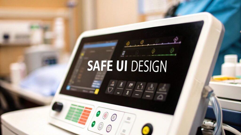
Medical device user interface design is how a person uses the device without hurting anyone: the screen, the buttons, the alarms, the sequence of taps in a noisy room. It is human factors and usability engineering. It is not verification vs validation. It is not a QMS. It is not the FDA class tree.
If you meant design V&V (built right vs the right device) → medical device verification and validation. If you meant IQ / OQ / PQ → medical device validation process. If you meant how a device is built (Phase 0–5) → medical device development process. If you meant QMS / ISO 13485 → medical device quality management system. If you meant FDA 510(k) / PMA / De Novo → FDA medical device approval process.
PYCAD builds custom web DICOM viewers and imaging models. A viewer is a UI. That does not make PYCAD a medical-device UI studio, a human-factors lab, or a 62366 consultancy.
The job is use-related harm
A beautiful screen that a tired nurse misreads at 03:00 is a failed device. The interface translates machine state — a rate, a waveform, a hanging protocol — into an action a human can take once. When the translation is wrong, the error is the design’s, not the user’s.
Human factors engineering (HFE) is the method: design for the people and the room you actually have, then test that. It is not a visual-design preference. It is not “make it look like iOS.”
| Principle | What it means on a device | What it is not |
|---|---|---|
| Cognitive load | Show the next action and the number that would change a decision. Hide the rest until asked | A dashboard of every tag the device knows |
| Hierarchy | The alarm and the dose are larger and closer than the settings menu | Equal weight on every tile because the mockup looked balanced |
| Context | Gloves, glare, a moving ambulance, a dim bedroom, a second language | A demo in a quiet conference room with a mouse |
| Recoverable error | A confirm on irreversible acts; an obvious undo; a dose that cannot silently wrap | “The user should have read the IFU” |
IEC 62366-1 and the FDA file
Two documents actually get cited. Neither is a vibe.
| Document | Who | What it asks |
|---|---|---|
| IEC 62366-1 | IEC / ISO | A usability-engineering process: analyse, specify, design, evaluate, and keep the records. Safety-related use is the scope, not “delight.” |
| FDA human-factors guidance (2016, Applying Human Factors and Usability Engineering to Medical Devices) | FDA / CDRH | Summative (validation) testing with representative users, on critical tasks, in a representative environment. The question is: can they use it safely, not “did they like it.” |
The usability engineering file (UEF) is the evidence, not a slide. Typical contents:
- Use specification. Who, where, what condition, what the device is for — and what it is not for.
- Hazard analysis for use. What happens if the alarm is missed, the decimal is one place over, the wrong patient is selected. ISO 14971 is the risk method; this file is the use slice. Risk as a programme is medical device risk management.
- Formative tests. Early, cheap, meant to change the design. A hallway of five nurses is a formative, not a validation.
- Summative / HF validation. Production-equivalent UI, representative users, critical tasks. Residual use-related risk that you will live with has to be named. That test is also a validation input on the V&V page. This page is the UI work that feeds it.
Bolting the UEF on the week of the 510(k) is how teams fail the file. The process starts when the use specification is still a page, not when the pixels are frozen.
Four rooms, four UIs
One device family can need more than one interface. A “universal” screen is how home users get an ICU layout and ICU users get a consumer gadget.
| Room | User | The UI has to survive |
|---|---|---|
| OR / ICU | A specialist who already knows the physiology | Glare, gloves, noise, a glance from two metres. Alarms that cut through other alarms. Dense data, short paths |
| Ward / clinic | A nurse or tech on a cart, many patients | Wrong-patient selection. Shared login. A task that cannot take a minute |
| EMS | A paramedic, one hand, bad light | Sun, rain, motion, gloves. Huge targets. No nested menus |
| Home | The patient or a family caregiver | Plain language, large type, a confirm that does not sound like a fault. Vision, tremor, a first-time user at 02:00 |
Color is a channel, not the message. Red-green deficiency is common enough in men that an alarm which is only a red badge will be missed. Pair color with a word and a shape. Test a grayscale build; if the hierarchy dies, the color was doing the job alone.
What this page is not
- Not 699 device-dev / QMS / GTM / PMS. Those URLs stay those URLs.
- Not 698. Class and 510(k) stay on the FDA page.
- Not 6052. Usability validation is evidence on the V&V page. The design work that produces that evidence is this page.
- Not unsourced “15–20% of adverse events” / “30% of recalls 2015–2020” / “30% better adherence.” Dropped. Use-related harm is real; those percents were not sourced here.
- Not mount-it.com carts, getnerdify UX listicles, or a homepage-as-product closer.
- Not a PYCAD device-UI studio.
If the missing piece is a web DICOM viewer a clinician can hang a study in, that is the imaging piece. Case studies.